BLOGGER TEMPLATES AND TWITTER BACKGROUNDS »

Sunday, May 2, 2010

Colors on decoration


Colors on decoration can be able to create a nice decorative image on your view. it has many view to create a very nice Decoration. They are given bellow


Colors though dresses


If u want to ware perfect dress which makes u more perfect with yourself then you must follow some rules.

  1. Understand that color is based on seasons and every person's coloring can be described as a season. There are two characteristics that determine which season's palette that you can best wear: warm or cool and clear or muted. If your coloring is warm and clear you are a "spring", if you are cool and clear you are a "winter", warm and muted is "autumn" and cool and muted is "summer."


  2. Realize that warm skin tones tend to have yellow undertones, while cool ones have blue. These undertones are very subtle and often difficult to see but if you have quite golden skin or appear sallow then you are warm. Blue undertones can often be seen as red cheeks or slight ruddiness.

  3. Learn that if your coloring is clear then it will probably be one of your most noticeable features. You will have a large contrast between your hair, skin and eyes and your skin will have a slight translucent quality. If you are muted, however, there will be a less noticeable contrast and you may have some ash tones in your coloring. Your coloring will probably be softer than that of a clear person.Pick colors for your features and seasons
  4. Find out which colors belong to your season's particular palette. You will probably be able to find out whether a color suits you if it has the same characteristics as are found in your coloring. If you are a spring, you will suit warm, clear colors, such as salmon or lime. Winters can wear cool, clear colors such as black, white and navy blue. Autumns can best wear warm, muted colors like olive green or terracotta and summers look best in cool, muted colors such as burgundy or pastels. Most people are naturally drawn to their best colors so this can also be an indication.

  5. Realize that many people can wear colors from another palette that shares characteristics with their own season's palette. You can work out which of these colors you can wear by deciding whether you are (if you are a spring) most noticeably warm or clear. If you are predominantly clear, for example, you will also be able to wear many winter colors. Someone who was warm and clear, predominantly clear, would be a spring-winter.


    Make An Impression

    U never get a 2nd chance to create another fantastic First Impression.

Tips

  • Not sure if you are warm or cool coloration? Use the "Gold and Silver Test". In front of a mirror, put a piece of metallic gold fabric or paper near your face, then do the same with a metallic silver piece of fabric or paper. (You can also do this with the back of your arm, especially if you have a tan). You can see more of a bluish or yellowish tint


  • Quick color reference guide:
    • Fair skin, try gray
    • Beige skin, try blue
    • Golden skin, try green
    • Bronze skin, try orange or pink
    • Deep skin, try red or pink
  • If you want to wear a color that is not in your seasonal palette, the best way to do this would be to wear it while having one of your best colors with it. This works with most colors. For example, a spring could wear a gray that was not usually her best color if she uplifted it with say, a warm, jewel green top.
  • You don't necessarily have to totally ban any color in your wardrobe, even if it clashes with your complexion. What's most important tends to be what's near your face. So, if you love bubble-gum pink, but it simply doesn't match your coloration, you can still wear a pink skirt, or enjoy pink handbags, shoes, and so on...just avoid it as a shirt color.
  • Realize no single color is entirely "off-limits" due to your coloring. It often depends on the hue, color make-up and so on of the garment. You might look horrible in a mustard but radiant in a pastel yellow, for instance.
  • The color coral usually looks good with all skin tones

Color contrast on make up.


At first you should apply some technique for having the perfect make up on your face.Fashion Makeup

Fashion makeup is used in magazine photography as well as on the fashion runway. Avant Garde Makeup is also an applicable technique used for projects that require experimental themes. Fashion makeup is also commonly used in Television and filmprime look to more sophisticated applications such as color balance. ranging for the natural
Theatrical Makeup
Stage makeup is used as a method in conjunction with stage lighting to highlight the actors' faces in order make expressions visible to the audience from moderate distances. This often includes defining the eyes and lips as well as the highlights and lowlights of the facial bones.
Special Effects Makeup (FX Makeup)
The use of special effectstechniques enhancing physical features to exhibit metaphysical characteristics as well as fantasy makeup. The use of prosthetics and plaster casting are also required for projects that entails non-human appearances. Accents such as Theatrical blood and ooze are also techniques applicable to this type of makeup.
Airbrushing
The use of an airbrush which is a small air-operated device that sprays various media including alcohol and water-based makeup by a process of nebulization. The earliest record of this type of cosmetic application dates back to the 1925 film version of Ben-Hur, it has recently been re-popularized by the advent of HDTV and Digital Photography, wherein the camera focuses on higher depths of detail. Liquid Foundations that are high in coverage but thin in texture are applied with the airbrush for full coverage without a heavy build-up of product

Variation of color on human


Every human are not same. the variation of humans color varies from skin, eyes, and hair.

Human skin color can range from almost black (in skin with very high concentrations of the dark brown pigment melanin) to nearly colorless (appearing pinkish white due to the blood vessels under the skin.) Skin color is determined primarily by the amount and type of melanin. Variations in skin color are mainly genetic in origin.

In general, people with ancestors from tropical regions and higher altitudes (who were hence exposed to greater ultraviolet radiation) have darker skin than people with ancestors from middle latitudes. This is far from a hard and fast rule, however, because many light-skinned groups have managed to survive at the equator through social adaptation. The same can be said of dark-skinned groups living at subtropical and temperate latitudes.

Eye color is a polygenic phenotypic character and is determined by the amount and type of pigments in the eye's iris. Humans and animals have many phenotypic variations in eye color, as blue, brown, green and others. These variations constitute phenotypic traits.

The genetics of eye color are complicated, and blue color is determined by multiple genes. Some of the eye-color genes include EYCL1 (a green/blue eye-color gene located on chromosome 19), EYCL2 (a brown eye-color gene) and EYCL3 (a brown/blue eye-color gene located on chromosome 15). The once-held view that blue eye color is a simple recessive trait has been shown to be wrong. The genetics of eye color are so complex that almost any parent-child combination of eye colors can occur.

Hair color is the pigmentation of hair follicles due to two types of melanin, eumelanin and pheomelanin. Generally, if more melanin is present, the color of the hair is darker; if less melanin is present, the hair is lighter. Levels of melanin can vary over time causing a person's hair color to change, and it is possible to have hair follicles of more than one color.

Particular hair colors can be associated with ethnic groups - however, due to migration and global travel, considerable variations have developed in the hair color of individuals within an ethnic group, creating a greatly increased diversity of hair color.

The reflection of color


Color internal reflection is an optical phenomenon that occurs when a ray of light strikes a medium boundary at an angle larger than a particular critical angle with respect to the normal to the surface. If the refractive index is lower on the other side of the boundary, no light can pass through and all of the light is reflected. The critical angle is the angle of incidence above which the total internal reflection occurs.

When light crosses a boundary between materials with different refractive indices, the light beam will be partially refracted at the boundary surface, and partially reflected. However, if the angle of incidence is greater (i.e. the ray is closer to being parallel to the boundary) than the critical angle – the angle of incidence at which light is refracted such that it travels along the boundary – then the light will stop crossing the boundary altogether and instead be totally reflected back internally. This can only occur where light travels from a medium with a higher [n1=higher refractive index] to one with a lower refractive index[n2=lower refractive index]. For example, it will occur when passing from glass to air, but not when passing from air to glass.

One can demonstrate total internal reflection by filling a sink or bath with water, taking a glass tumbler, and placing it upside-down over the plug hole (with the tumbler completely filled with water). While water remains both in the upturned tumbler and in the sink surrounding it, the plug hole and plug are visible since the angle of refraction between glass and water is not greater than the critical angle. If the drain is opened and the tumbler is kept in position over the hole, the water in the tumbler drains out leaving the glass filled with air, and this then acts as the plug. Viewing this from above, the tumbler now appears mirrored because light reflects off the air/glass interface.

Another very common example of total internal reflection is a critically cut diamond. This is what gives it maximum sparkle.

Saturday, May 1, 2010

Beauty of colorful birds


Do you know that every specific birds has its unique color which make it more attractive. Such as the

Golden-headed Quetzal

Males and females are approximately the same size, having a total length of ca. 35 cm and a weight of 160 g. as adults. Adult males are iridescent green with a golden cast to their heads, black wings, bright red bellies, and a yellow bill. The female is duller with a Grey head and lower chest and a dusky bill. Both sexes have an entirely blackish under tail unlike the Crested Queasily.

Oriole may mean:

Green-headed Tanager

The Green-headed Tanager, Tangerine seledon, is a bird found in Atlantic forest in south-eastern Brazil, far eastern Paraguay and far north-eastern Argentina (Misiones only).

As other members of the genus Tangerine, it is a small colorful bird, measuring an average of 13.5 centimeters (5.3 in). While essentially a bird of humid forests, it is also common in orchards and parks, where it moves through the canopy, making itself inconspicuous, as its apparently flashy blue-green coloration camouflages it well amongst the foliage.

Beauty of fruits color


Can u imagine that every fruits has some unique which make the fruits very perfect and attractive. If we imagine about every color of fruits then we will be realize the concept. Such that type of fruits is peach.

Peach is a color that combines pink and orange colors. This color is named for the pale color of the peach fruit. Like the color apricot, the color called peach is paler than most actual peach fruits and seems to have been formulated (like the color apricot) primarily to create a pastel palette of colors for interior design. Peach can also be described as pale orange. At right is displayed the color peach.

The shade of peach shown at right approximates the color of the interior flesh of that variety of peaches known as white peaches.

The first recorded use of peach as a color name in English was in 1588. [1] Etymology of peach

The etymology of the color peach (and the fruit): the word comes from the Middle English peche, derived from Middle French, in turn derived from Latin persica, i.e., the fruit from Persia. In actuality, the ultimate origin of the peach fruit was from China.

Beauty of trees leaf color


The beauty of trees leaf color is very attractive. because it creates a colorful symbol on the various season.

Autumn leaf color is a phenomenon that affects the normally green leaves of many deciduous trees and shrubs by which they take on, during a few weeks in the autumn season, one or many colors that range from red to yellow. The phenomenon is commonly called fall colors and autumn colors, while the expression fall foliage usually connotes the viewing of a tree or forest whose leaves have undergone the change. In some areas of Canada and the United States, "leaf peeping" tourism between the beginning of color changes and the onset of leaf fall, or scheduled in hope of coinciding with that period, is a major contribution to economic activity. A green leaf is green because of the presence of a pigment known as chlorophyll. When they are abundant in the leaf's cells, as they are during the growing season, the chlorophyll s' green color dominates and masks out the colors of any other pigments that may be present in the leaf. Thus the leaves of summer are characteristically green.Chlorophyll has a vital function: that of capturing solar rays and utilizing the resulting energy in the manufacture of the plant's food—simple sugars which are produced from water and carbon dioxide. These sugars are the basis of the plant's nourishment—the sole source of the carbohydrates needed for growth and development. In their food-manufacturing process, the chlorophyll's themselves break down and thus are being continually "used up." During the growing season, however, the plant replenishes the chlorophyll so that the supply remains high and the leaves stay green.

Beauty of flowers colors


Every flowers has some symbolic meaning which makethe flower more beautyful to our. if we say about the rose then we will realize about it.

Different colored roses have different meanings.

  • Red - A red rose is an expression of love. Red Roses usually show deep feelings, like love, longing, or desire. Red Roses can also be used to show respect, admiration, or devotion. A deep red rose can be used to show regret and sorrow. The number of red roses has special meanings symbolizing them. 12 red roses are the most popular of all which means, "Be mine" and "I love you".[6]
  • Pink - There are a lot of variations of the pink rose. Usually, pink roses are used to express gentle emotions such as admiration, joy and gratitude.[6]
  • Dark pink - Deep pink rose blooms may mean deep gratitude and appreciation. Dark Pink roses also express elegance and grace.[6]
  • Light pink - Light pink rose blooms are symbols of sweetness and innocence.[6]
  • White - White is the color of purity and innocence. White roses usually may symbolize a new start, and it is a custom for brides to hold them when she walks down the isle at her wedding. White roses can be used to show sympathy or humility. They also may be about spiritual things.[6]
  • Yellow - Yellow roses are usually used as an expression of exuberance. Yellow roses show sunny feelings of joy, warmth, and sometimes welcome. They are symbols of friendship and caring. The yellow rose, unlike some of the other roses, does not mean or express any romance.[6]
  • Orange - Orange roses remind most people of a fiery blaze. These fiery blooms are symbols of passionenergy. Orange roses can be used to show desire and pride.[6] and
  • Burgundy - The color of burgundy is a symbol of beauty.[6]
  • Green - Green roses (these are sometimes white roses with shades of green) can symbolize best wishes, luck, and blessings for a good life or recovery of good health.[6]
  • Blue - Blue roses cannot be found in the nature, like Black roses, and so they represent the unattainable or the mysterious. Blue roses therefore show the desire for the goals you cannot reach. They may sometimes mean, "I can't have you but I can't stop thinking about you".[6]
  • Black - Black is the color of death and farewell. A black roses show the death of a feeling or idea. Sending black roses to someone indicates the death of the relationship, or sometimes it may be used in burials.[6]
  • Purple - A purple rose may show protection, and also a sense of majesty, royalty, and splendor. These roses are used to show adoration.[6]
  • Lavender - A Lavender rose, like its color, shows enchantment. It also expresses "love at first sight".[6]

Thursday, April 29, 2010

Color codes on electron


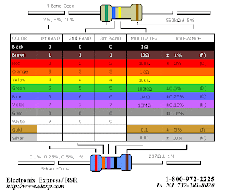
The electronic color code discussed here is used to indicate the values or ratings of electronic components, very commonly for resistors, but also for capacitors, inductors, and others. A separate code, the 25-pair color code, is used to identify wires in some telecommunications cables. Colorbands were commonly used (especially on resistors) because they were easily printed on tiny components, decreasing construction costs. However, there were drawbacks, especially for color blind people. Overheating of a component, or dirt accumulation, may make it impossible to distinguish brown from red from orange. Advances in printing technology have made printed numbers practical for small components, which are often foun The standard color code per EN 60062:2005 is as follows: Color Significant figures Multiplier Tolerance Temp. Coefficient (ppm/K)
1.Black 0 ×100 – 250 U 2.Brown 1 ×101 ±1% F 100 S 3.Red 2 ×10² ±2% G 50 R 4.Orange 3 ×10³ – 15 P 5.Yellow 4 ×10⁴ – 25 Q 6.Green 5 ×10⁵ ±0.5% D 20 Z Blue 6 ×10⁶ ±0.25% C 10 Z 7.Violet 7 ×10⁷ ±0.1% B 5 M 8.Gray 8 ×10⁸ ±0.05% A 1 K 9.White 9 ×10⁹ – – 10.Gold – ×10-1 ±5% J – 11.Silver – ×10-2 ±10% K – 12.None – – ±20% M – d in modern electronics.

Traffic light on color


Traffic lights, which may also be known as stoplights, traffic lamps, traffic signals, stop-and-go lights, robots or semaphore, are signaling devices positioned at road intersections, pedestrian crossings and other locations to control competing flows of traffic. Traffic lights have been installed in most cities around the world. They assign the right of way to road users by the use of lights in standard colors (Red - Amber - Green), using a universal color code (and a precise sequence, for those who are color blind). Typically traffic lights consist of a set of three colored lights: red, amber and green. In a typical cycle, • Illumination of the green light allows traffic to proceed in the direction denoted, • Illumination of the amber light denoting if safe to, prepare to stop short of the intersection, and • Illumination of the red signal prohibits any traffic from proceeding. Usually, the red light contains some orange in its hue, and the green light contains some blue, to provide some support for people with red-green color blindness

Color codes of fire extinguishers


A fire extinguisher is an active fire protection device used to extinguish or control small fires, often in emergency situations. It is not intended for use on an out-of-control fire, such as one which has reached the ceiling, endangers the user (i.e. no escape route, smoke, explosion hazard, etc.), or otherwise requires the expertise of a fire department. Typically, a fire extinguisher consists of a hand-held cylindrical pressure vessel containing an agent which can be discha nternationally there are several accepted classification methods for hand-held fire extinguishers. Each classification is useful in fighting fires with a particular group of fuel. [edit] Australia Type Pre-1997 Current Suitable for use on Fire Classes (brackets denote sometimes applicable) Water Solid red Solid red A Foam Solid blue Red with a blue band A B Dry chemical (powder) Red with a white band Red with a white band A B C E Carbon dioxide Red with a black band Red with a black band (A) B C E F Vaporising liquid (not halon) Red with a yellow band Red with a yellow band A B C E Halon Solid green No longer produced A B E Wet chemical Solid oatmeal Red with an oatmeal band A F In Australia, yellow (Halon) fire extinguishers are illegal to own or use on a fire, unless an essential use exemption has been granted.[8] rged to extinguish a fire.

Color code on optical Fibre


The buffer or jacket on patchcords is often color-coded to indicate the type of fiber used. The strain relief "boot" that protects the fiber from bending at a connector is color-coded to indicate the type of connection. Connectors with a plastic shell (such as SC connectors) typically use a color-coded shell. Standard color codings for jackets and boots (or connector shells) are shown below: Buffer/jacket color Meaning:
1.Yellow single-mode optical fiber 2.Orange multi-mode optical fiber 3.Aqua 10 gig laser-optimized 50/125 micrometer multi-mode optical fiber
4.Grey outdated color code for multi-mode optical fiber 5.Blue Sometimes used to designate polarization-maintaining optical fiber


Colors Codes on 3D


Complementary color anagrams employ one of a pair of complementary color filters for each eye. The most common color filters used are red and cyan. Employing tristimulus theory, the eye is sensitive to three primary colors, red, green, and blue. The red filter admits only red, while the cyan filter blocks red, passing blue and green (the combination of blue and green is perceived as cyan). If a paper viewer containing red and cyan filters is folded so that light passes through both, the image will appear black. Another recently introduced form employs blue and yellow filters. (Yellow is the color perceived when both red and green light passes through the filter.). Scientific images where depth perception is useful include, for instance, the presentation of complex multi-dimensional data sets and stereographic images of the surface of Mars. With the recent release of 3D DVDs, they are more commonly being used for entertainment. Anaglyph images are much easier to view than either parallel sighting or crossed eye stereo grams, although these types do offer more bright and accurate color rendering, most particularly in the red component, which is commonly muted or desaturated with even the best color anaglyphs. A compensating technique, commonly known as Anachrome, uses a slightly more transparent cyan filter in the patented glasses associated with the technique. Processing reconfigures the typical anaglyph image to have less parallax to obtain a more useful image when viewed without filters.

Identification by color


HMIS (Hazardous Materials Identification System) is a numerical hazard rating that incorporates the use of labels with color-coded bars as well as training materials. It was developed by the National Paint & Coatings Association (NPCA) as a compliance aid for the OSHA Hazard Communication Standard. The HMIS Color Bar is similar to the fire diamond, created by the National Fire Protection Association. Before 2002 the fire diamond and the color bar both had sections colored blue, red, white, and yellow. After April 2002, with the release of HMIS III, yellow in the color bar (which stood for reactivity) was replaced by orange, standing for physical hazard. The fire diamond is designed for emergencies when information about the effects of short, or acute, exposure is needed. The color bar is not for emergencies and is used to convey broader health warning information. The four bars are color coded, using the modern color bar symbols with blue indicating the level of health hazard, red for flammability, orange for a physical hazard, and white for Personal Protection. The number ratings range from 0-4.

Life Style and Color


A lifestyle is a characteristic bundle of behaviors that makes sense to both others and oneself in a given time and place, including social relations, consumption, entertainment, and dress. The behaviors and practices within lifestyles are a mixture of habits, conventional ways of doing things, and reasoned actions. A lifestyle typically also reflects an individual's attitudes, values or worldview. Therefore, a lifestyle is a means of forging a sense of self and to create cultural symbols that resonate with personal identity. In every style there is some personality shapes of color which make one life style perfect.

Layout on color


If you get bored with the default Wikipedia layout and Mono book color scheme, Wikipedia lets you change everything like colors, fonts, layouts in just one click. Take a look at some of the new Wikipedia layouts below: Like a lot of people, I am addicted to Wikipedia everyday. But I found the white background color is too blinking. This is not good to our eyes. Could anybody help us write a simple script to change the background to some eye-friendly color, say gray or alike. Thanks a lot! You should use Stylish. I made this simple style but you can use Firebug and change it for different parts of the site. What would be even better would be to look up a Grey theme on user styles.org

Wednesday, April 28, 2010

Color on Design Craft


Design craft is the process of creating intricate patterns on textiles with wax-resistant dyes. There seems to be some controversy surrounding the origins of the technique but according to the Wikipedia article discoveries showed it already exists in the Middle East, India and Central Asia over 2000 years ago. In Java, Indonesia, batik predates written records, but some experts argue that the technique might have been introduced during the 6th or 7th century from India. Traditional colors include indigo, dark brown, and white which represent the three major Hindu Gods (Brahmā, Visnu, and Śiva). The colors of persist batik, from the coastal cities of northern Java, are especially vibrant, and it absorbs influence from the Javanese, Chinese and Dutch culture.

Tuesday, April 27, 2010

Fashion trends on color


A fashion trends is something that designers put together each season to show their idea of new trends in both their high end couture range as well as their mass market range. It is considered to have a planned obsolescence usually of one to two seasons. A season is defined as either autumn/winter or spring/summer.Fashion designers work in different ways. Some sketch their ideas on paper, while others drape fabric on a dress form. When a designer is completely satisfied with the fit of the toile (or muslin), he or she will consult a professional pattern maker who then makes the finished, working version of the pattern out of card. The pattern maker's job is very precise and painstaking. The fit of the finished garment depends on their accuracy. Finally, a sample garment is made up and tested on a model.

Sunday, April 25, 2010

Culture and Color


In every culture colors combines the main contents. Such as if u select the color such as black, red blue and green. All of the single colors has its own symbol.
Black
Black, corresponding to water, is a neutral color. The Book of Changes, regards black as Heaven’s color. The saying “heaven and earth of mysterious black” was rooted in the observation that the northern sky was black for a long time. They believed Heavenly Emperor, resided in the North Star.
Red
Red, corresponding with fire, symbolizes good fortune and joy. Red is found everywhere during Chinese New Year and other holidays and family gatherings. A red envelope is a monetary gift which is given in Chinese society during holiday or special occasions. The red color of the packet symbolizes good luck. Red is strictly forbidden at funerals as it is a traditionally symbolic color of happiness.
Green
Generally green is associated with health, prosperity, and harmony. However, green hats are associated with an used as an idiom for a cuckold. This has caused uneasiness for Catholic bishops, who in heraldry would normally have a green hat above their arms.

Image quality on color


A color image is usually stored in memory as a raster map, a two-dimensional array of small integer triplets; or (rarely) as three separate raster maps, one for each channel. Eight bits per sample (24 bits per pixel) seem to be adequate for most uses, but faint banding artifacts may still be visible in some smoothly varying images, especially those which have been subject to processing. Particularly demanding applications may use 10 bits per sample or more. On the other hand, some widely used image file formats and graphics cards may use only 8 bits per pixel, i.e. only 256 different colors, or 2–3 bits per channel. Converting continuous-tone images like photographs to such formats requires dithering and yields rather grainy and fuzzy results. Graphics cards that support 16 bits per pixel provide 65536 distinct colors, or 5–6 bits per channel. This resolution seems to be satisfactory for non-professional uses, even without dithering.

Color and temparature


We have all heard the question, “What’s your favorite color?” at some point in time, usually on an online personality test. While there are those of us who believe this to have some sort of basis, there are others who are more skeptical. What makes us associate black with evil, white with purity, and blue with peace? Why do we like some colors better than others? (http://www.infoplease.com/spot/colors.html) Is any of this color nonsense relevant? A recent study suggests that it is. The study found that colors can have an effect on perception of individuals in a purchasing environment; essentially, cool colors yield more positive purchasing results (Yildirim, Akalin-Baskaya, & Hidayetoglu, 2007). It would seem perceptions of colors can impact your mood. Wexner (1954) conducted a study to determine what colors we associate with adjectives that possessed the same meaning as the mood-tone. Participants in the experiment were asked to choose the color that best fit each word group (which consisted of the mood-tone and adjectives). As most people might expect, black was associated with power, yellow with cheerfulness, and so on. What is interesting is that the intensity of the color affected which colors were associated with which words. In other words, how dark (or light) the color was determined if it was appropriate to associate it with a word, such as dignified. In a separate study, it was found that color also has an effect on the way that we react to and perceive various scenes, particularly when the structure of a scene is obscured in some way (Castelhano & Henderson, 2007). How is this related to Wexner’s experiment? This indicates that atmosphere of a room and the mood we get when in a room is altered by the color, very much in agreement with the study done by Yildirim, et al. (2007), where the structural elements in the area weren’t changed.